Here is the Film version of Revelation Is More Perilous Than Revolution –
Maybe less is more? more natural color?
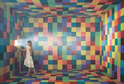
A production take on Loud, in collaboration with Artist Michelle Jane Lee. I originally wanted to do a totally obnoxious set with all color squares and then I remember looking at Michelle’s work at an artshow in the Brewery. I then approached her to work directly with me in a set collaboration, she agreed. In Michelle’s work all of her colored squares represent letters of the alphabet. Check out more at http://www.michellejanelee.com/
.jpg)
No comments:
Post a Comment